Trapped in the Echo Chamber
An Exploratory Interaction Design Project Focusing on the Dangerous Side Effects of the Twitter Algorithm.
Project Summary
When a social media algorithm highlights only what a person believes in, it reinforces ideas and creates a more polarised point of view. Twitter is a major offender in this regard, as numerous journal articles, news reports, and case studies highlight its involvement in a number of high-profile cases where Echo Chambers cause a clear and dramatic escalation in behaviour. I wanted to do this project because I believe people are entitled to know how best to handle this when online.
Initial Research.
When starting the project, I knew very little about social media algorithms and how best to tackle such a heavy subject so I began researching the people who have already covered the topic. The best I found was by Bannerman et al and Coda et al, with both providing strong visual elements that helped better illustrate
Coda et Al showed the masses in the most straightforward and easy to understand manner.
Bannerman et al showed me the topics they had best researched and the lack of interaction between the two extremes in regards to said topics
.
Gamification
When beginning to build the prototype, I realise that gamifying the interaction made the overall experience more engaging and thus easier to learn from so I created a mock dashboard that the user could interact with that - theoretically - a machine learning algorithm could use to see what echo chambers a user could end up in.
Final Display
After submittng the data, the final screen is an interactive display detailing the users, what the end profile looks like and the likelihood of being in an echo chamber. If it is high, then which echo chambers has the user entered.
Have a look
Posters

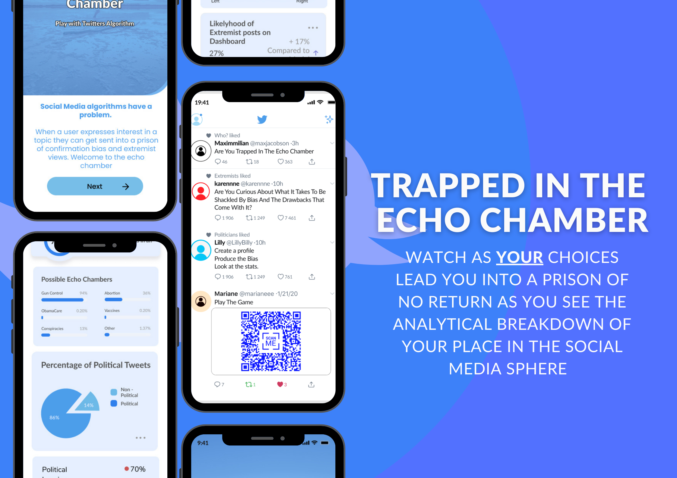
This was the 1st iteration of the resulting poster. It has a mock dashboard promoting the product and a QR code to take people to the prototype. It didn't look like a twitter advert so I redesigned it.

This was the 2nd poster modeled after a Twitter advert I liked. I kept the mock dashboard but felt that the blue was too bright

I darkened the blue and added a plain circle background instead of the twitter logo but it still felt too plain.

This was the final poster which kept all the elements I like but added a red and blue background to match the Coda et al visualisation


